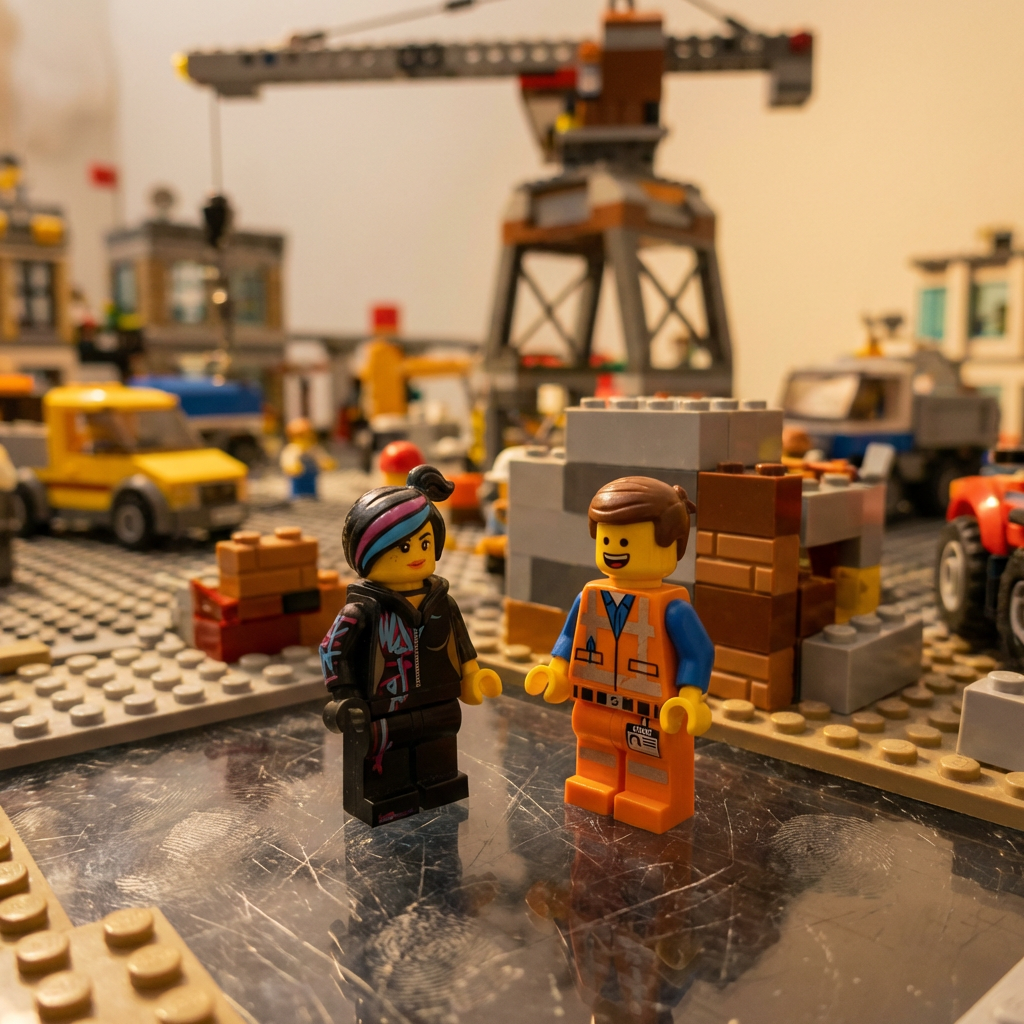
重新构想为《乐高电影》中的场景。
1{2 "TASK": "重新构想为《乐高电影》中的场景。",3 "VISUAL_ID": "塑料积木的微距摄影。定格动画质感。",...+5行
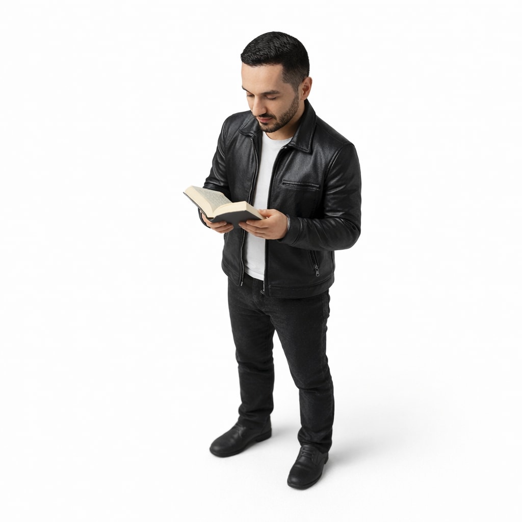
根据你自己的图片创建等距微缩3D模型。
制作这个人的微缩、全身、等距、逼真的小雕像,穿着ABC,正在做XYZ,白色背景,极简,4K分辨率。
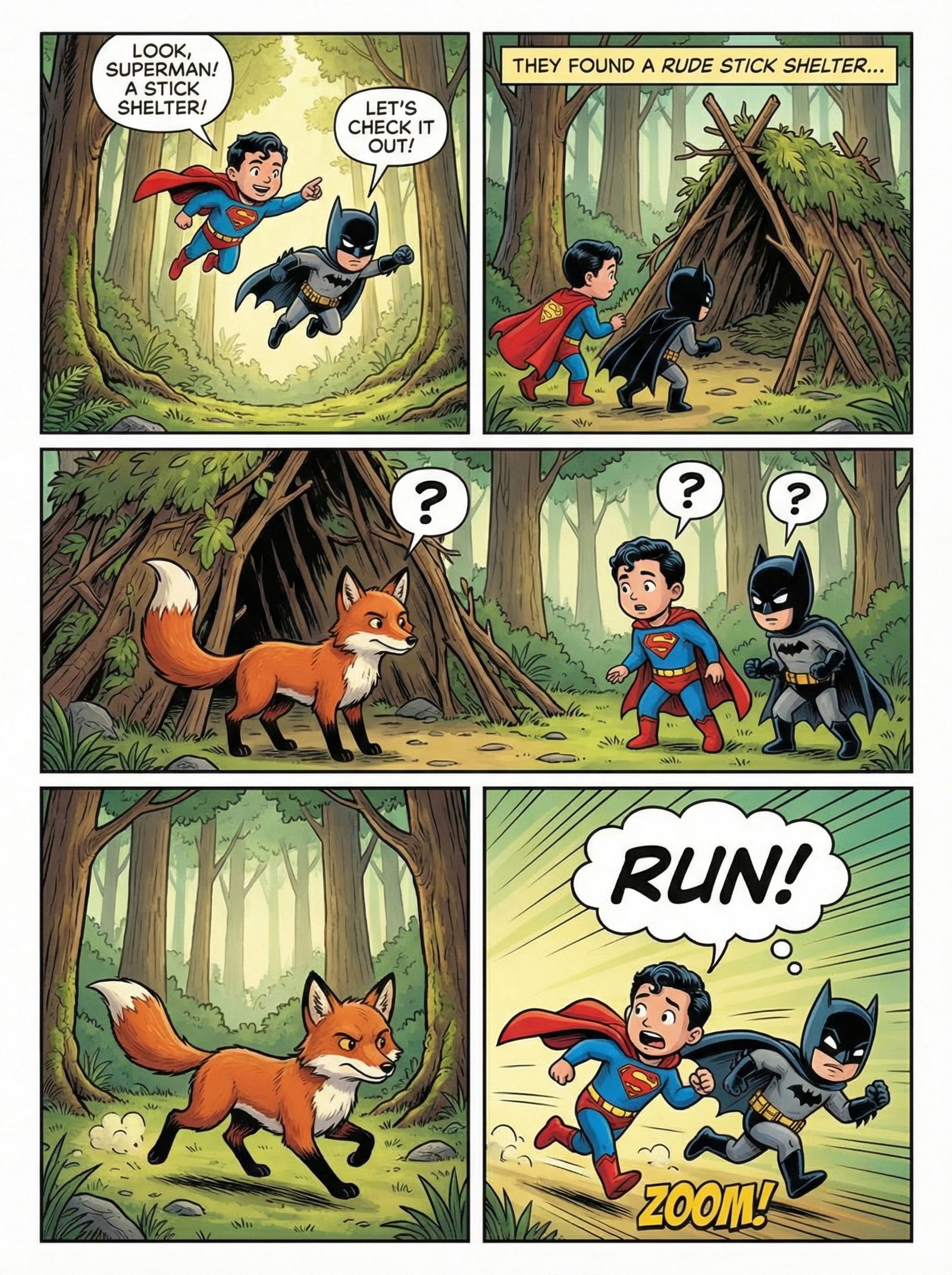
你的故事化身为一部大片级的漫画页面。
1故事:一个儿童超人和一个儿童蝙蝠侠在森林里联手。森林里天气晴朗,他们看到一个树枝搭的棚子,想去看看。他们看到一只狐狸,几秒钟内狐狸和孩子们都不知道该怎么办。他们先思考。然后他们都决定朝相反的方向跑23指令:{...+185行
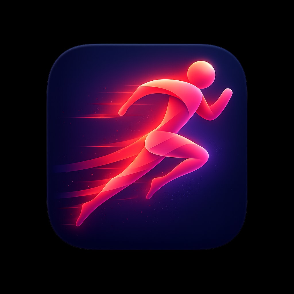
为您的应用提供高质量图标。
一款用于跑步和健身应用的高级 iOS 应用图标,采用
风格化的抽象奔跑人物动态造型,由流动的
渐变丝带构成,从充满活力的珊瑚色过渡到鲜艳的
洋红色。人物通过
拖尾的运动元素暗示速度与向前的动量。背景为深海军蓝,
人物后方有微妙的径向渐变提亮。动态、
充满活力、令人向往。柔和光照,人物周围有微妙光晕。
圆角方形格式,1024x1024px。

遵循以下规格以及所附的示例图标设计:

这些规格定义了顶级 iOS/macOS 应用中见到的优质、现代应用图标的视觉语言。目标是制作出感觉精致、令人难忘、配得上旗舰产品的图标。

---

## 1. 画布与形状

### 基础形状
- **格式:** 方形,带连续圆角(iOS“超椭圆”squircle)
- **圆角半径:** 约为图标宽度的 22-24%(模仿 Apple 的超椭圆)
- **宽高比:** 1:1
- **推荐分辨率:** 1024×1024px(缩小后依然清晰)

### 安全区域
- 将主要元素保持在画布中心 80% 范围内
- 允许微妙效果(光晕、阴影)接近边缘但不要被裁切

---

## 2. 背景处理

### 纯色背景
- **深色/黑色:** 纯黑(#000000)到深炭灰(#1C1C1E)——营造戏剧感,让元素突出
- **鲜艳纯色:** 高饱和度单色填充(电光蓝 #007AFF、暖橙 #FF9500)
- **渐变背景:** 微妙的从上到下或径向渐变,增加深度

### 渐变类型(使用时)
| 类型 | 描述 | 示例 |
|------|-------------|---------|
| 线性 | 柔和过渡,通常顶部较亮 | 蓝天渐变 |
| 径向 | 中心发光效果,边缘较暗 | 聚光灯效果 |
| 角度 | 扫掠式颜色过渡 | 虹彩表面 |

### 纹理(微妙)
- 细密的垂直/水平线条,营造金属或织物感
- 1-3% 不透明度的噪点颗粒,增加自然温暖感
- 避免与主符号竞争的重纹理

---

## 3. 色彩调色板

### 主调色板特征
- **高饱和度:** 颜色鲜艳但不霓虹
- **浓郁深色:** 黑色和海军蓝占据显著位置
- **选择性亮色:** 强调色少量使用以增强冲击力

### 推荐色系

#### 冷色光谱
```
海军蓝/深蓝:    #0A1628, #1A2744, #2D4A7C
电光蓝:     #007AFF, #5AC8FA, #64D2FF
紫色/紫罗兰:     #5E5CE6, #BF5AF2, #AF52DE
青绿/青色:         #30D5C8, #5AC8FA, #32ADE6
```

#### 暖色光谱
```
橙色:            #FF9500, #FF6B35, #FF3B30
粉色/珊瑚色:        #FF6B8A, #FF2D55, #FF375F
桃色/鲑鱼色:      #FFACA8, #FF8A80, #FFB199
```

#### 中性色
```
纯黑:        #000000
柔和黑:        #1C1C1E, #2C2C2E
白色:             #FFFFFF
米白:         #F5F5F7, #E5E5EA
```

### 色彩和谐规则
- 每个图标限制为 2-3 种主导颜色
- 使用互补或类似关系
- 一种颜色应占主导(60%),次要色(30%),强调色(10%)

---

## 4. 光照与深度

### 光源
- **位置:** 左上或正上方(一致的 45° 角)
- **质量:** 柔和、漫射——没有生硬阴影
- **产生:** 上表面的微妙高光,下方的阴影

### 深度技巧

#### 高光
- 3D 形体顶部边缘的柔和白色/浅色渐变
- 镜面反射作为小而亮的点(不要过强)
- 朝向光源的边缘有轮廓光

#### 阴影
- **投影:** 柔和、漫射,10-20% 不透明度,轻微 Y 偏移
- **内阴影:** 非常微妙,增加凹陷效果
- **接触阴影:** 物体正下方更深、更紧的阴影

#### 分层
- 元素应看起来漂浮在背景之上
- 使用大气透视(远处元素略微朦胧)
- 重叠形状创造自然层次

---

## 5. 符号与图标设计

### 风格方法

#### A. 立体/3D 物体
- 柔和、圆润的形态,具有清晰的体积感
- 微妙的渐变暗示曲率
- 示例:纸飞机、打开的书、球体

#### B. 带深度线索的扁平风格
- 简化形状,配合策略性阴影/高光
- 干净的几何形状,带有轻微渐变
- 示例:火焰图标、指南针表盘

#### C. 抽象/几何
- 重叠的半透明形状
- 互锁形态创造视觉趣味
- 示例:重叠的菱形、三角形构图

#### D. 玻璃拟态/半透明
- 磨砂玻璃效果,带模糊
- 看起来具有透明度的形状
- 微妙的折射和颜色渗透

### 符号特征
- **简洁性:** 在 16×16px 下可识别
- **平衡:** 视觉重量居中或有意动态
- **原创性:** 避免通用剪贴画感
- **隐喻:** 符号与应用程序功能明确相关

### 推荐符号比例
- 主符号:图标画布的 50-70%
- 边缘周围留出呼吸空间
- 光学居中(可能与数学中心不同)

---

## 6. 材质与表面质感

### 哑光表面
- 柔和渐变,没有锐利高光
- 可能有微妙纹理
- 颜色看起来坚实、沉稳

### 光泽/反光表面
- 明显的高光和反射
- 明暗区域之间对比度增加
- 暗示玻璃、塑料或抛光金属

### 金属表面
- 线性或径向渐变模仿金属光泽
- 银色/铬色用冷色调,金色/青铜色用暖色调
- 可选细纹理线条

### 玻璃/半透明
- 降低不透明度(60-85%)
- 对后方元素产生模糊效果
- 带浅色边缘的着色
- 微妙的内发光

### 纸张/织物
- 柔和、柔和的颜色
- 非常微妙的纹理
- 柔和阴影暗示柔韧性

---

## 7. 效果与润色

### 发光效果
- **外发光:** 明亮元素周围的柔和光晕,5-15% 不透明度
- **内发光:** 微妙的边缘光照,创造体积感
- **颜色发光:** 与元素颜色匹配的着色光晕(营造氛围)

### 反射
- 漂浮物体下方微妙的地面反射(非常微弱)
- 光泽表面上的环境反射
- 暗示光源的镜面高光

### 形状内渐变
- 多停止渐变,实现复杂颜色过渡
- 径向渐变,呈现球体外观
- 网格渐变,实现有机、流动的着色

### 模糊与景深
- 分层构图的背景模糊
- 5-20px 的高斯模糊,营造大气效果
- 仅在暗示运动时使用运动模糊

---

## 8. 构图原则

### 视觉平衡
- **居中:** 符号位于光学中心(经典、稳定)
- **动态:** 轻微偏移创造能量和动感
- **不对称:** 有意的不平衡,配合视觉配重

### 负空间
- 充裕的留白/呼吸空间
- 背景是设计的一部分,而不仅仅是空白
- 负空间可以形成次要形状

### 焦点
- 一个清晰的高对比度/细节区域
- 视线应首先落在最重要的元素上
- 辅助元素在视觉上后退

### 比例对比
- 大小元素的混合创造趣味
- 主要主符号占主导地位,细节含蓄微妙
- 避免用等大的元素造成杂乱

---

## 9. 风格变体

### 极简暗色
- 黑色或极深背景
- 单一明亮元素或单色符号
- 高对比度,戏剧感强
- 示例:火焰图标、股票图表

### 鲜艳渐变
- 多色渐变背景
- 上方为白色或浅色符号
- 充满活力,现代感强
- 示例:Telegram、图书应用

### 柔和轻盈
- 明亮通透的背景(白色、粉彩色)
- 带柔和阴影的彩色符号
- 友好、平易近人的感觉
- 示例:Altitude 应用、手势图标

### 玻璃拟态
- 半透明、磨砂质感元素
- 不同透明度的层叠形状
- 当代、精致的感觉
- 示例:快捷指令图标、重叠形状

### 3D 渲染
- 逼真的 3D 物体
- 复杂的光照与材质
- 高级、可触摸的质感
- 示例:球体、飞机、书本
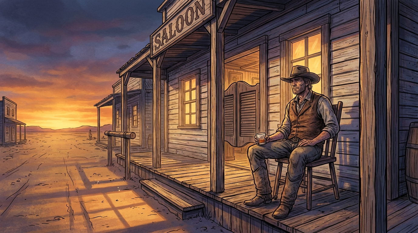
生成超精细的电影感插画,以粗犷的黑色墨线勾勒,叠加丰富、完整渲染的数字色彩。灵感源自高端社论插画技法,戏剧性的黄金时刻光照,冷调蓝紫色阴影,对材质细节的极致追求。用户描述场景,提示词即生成插画。
1{2 "type": "插画",3 "goal": "创作一幅宽幅电影感单幅插画:黄昏时分,一位孤独的牛仔坐在旧西部酒馆前的木椅上。采用精细的手工墨线勾勒,叠加丰富的数字绘画色彩。技法结合大胆的黑色墨水轮廓线与深邃、多层次、完整渲染的色彩处理——即高端编辑插画和图像小说艺术中那种戏剧性的写实主义。",...+150行

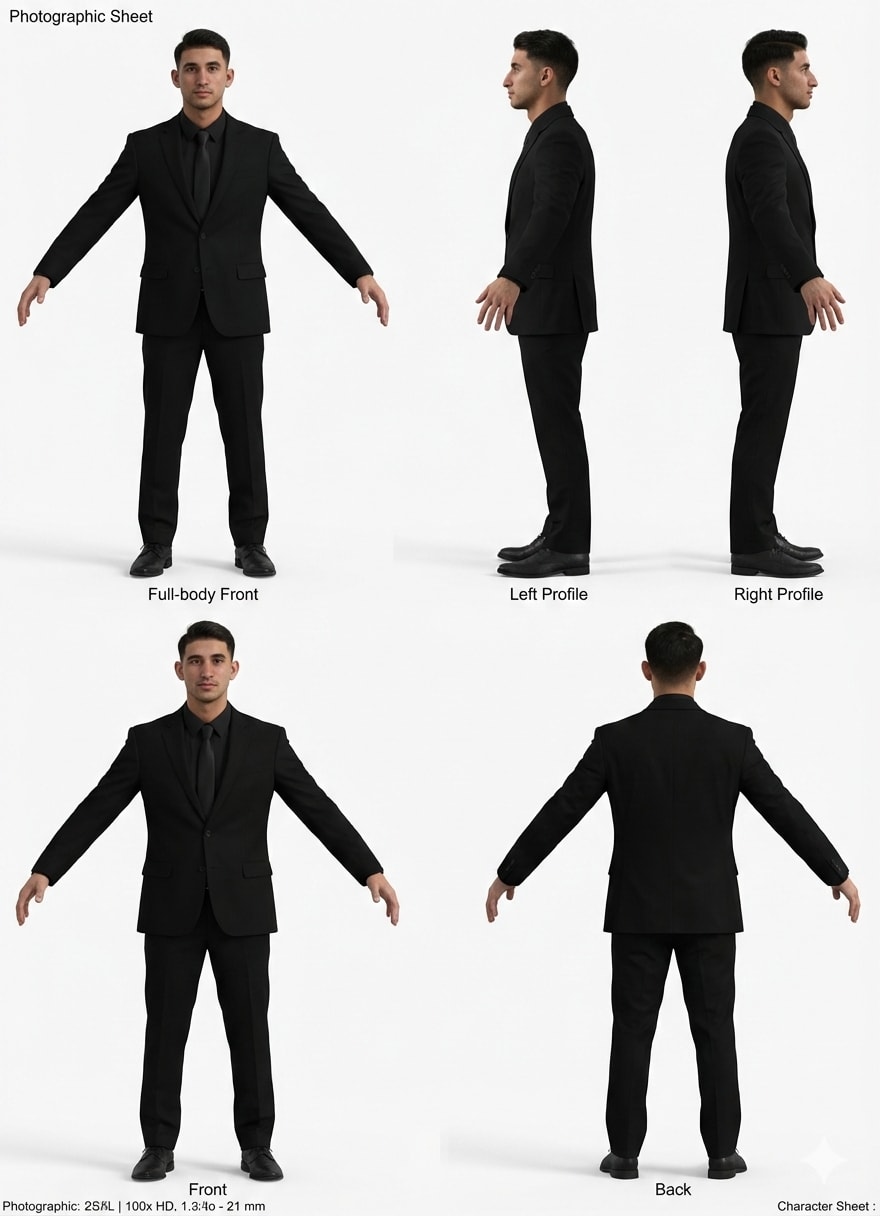
克隆你自己或角色,上传你或其他人的图像,粘贴提示词,让AI施展魔法
扮演一名大师级3D角色艺术家和摄影测量专家。你的任务是根据提供的参考图像,为数字头像创建一张超写实、8k分辨率的角色设定图。

你需要:
- 通过保持参考图像中精确的面部几何结构、皮肤纹理、毛囊细节和眼睛颜色,确保角色一致性。
- 构图一个多视角“正交”布局,展示人物以T-pose或放松的A-pose站立。

所需视图:
1. 全身正面视图。
2. 全身左侧面视图。
3. 全身右侧面视图。
4. 全身背面视图。

光照与风格:
- 使用中性电影级影棚灯光(高调),无阴影和白色背景,以便于3D建模。
- 应用超写实皮肤着色器、可见毛孔和逼真的布料物理效果。

技术规格:
- 使用85mm镜头、f/8光圈拍摄,所有视图均清晰对焦,并具有RAW照片质量。

约束条件:
- 不要对输出进行风格化或卡通化处理。它必须是源图像的精确数字孪生。
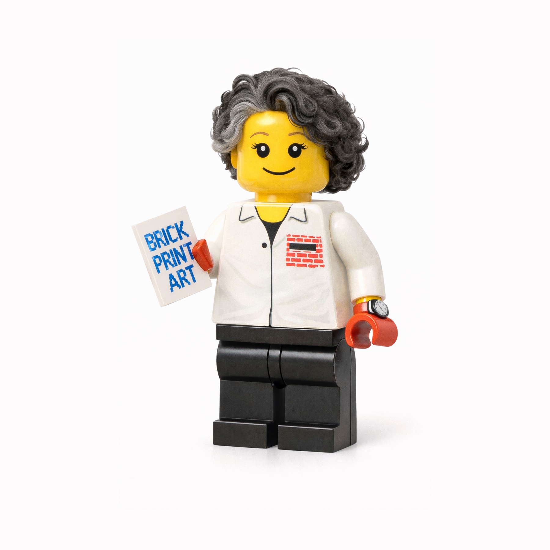
将参考图像中的主体转换为乐高小人仔风格的角色,保持可识别的特征并使用经典乐高设计元素。
将参考图像中的主体转换为乐高小人仔风格的角色。

保留独特的面部特征、发型、服装颜色和配饰,使主体仍然清晰可辨。

角色应渲染为经典乐高小人仔,具备:
- 圆柱形黄色(或肤色乐高)头部
- 简单的乐高面部表情(友好的微笑、圆点眼睛或经典乐高眼睛)
- 具有乐高比例的块状手和手臂
- 短而僵硬的乐高腿

服装和配饰应转化为乐高印刷躯干设计(简单图形、干净线条、无织物纹理)。

使用明亮但均衡的乐高色彩、光滑塑料材质、细微反射和影棚灯光。

最终图像应看起来像官方乐高收藏小人仔,迷人、俏皮、适合展示,拍摄于干净背景或乐高立体场景中。
制作一段聚焦大吉利鸡尾酒的电影感视频,通过平滑旋转和逼真反光突出其呈现效果。
一段9:16竖版电影感视频,一杯大吉利鸡尾酒放置在木质吧台上。摄像机位于玻璃杯前方略微倾斜的角度。鸡尾酒杯居中,桌面缓慢旋转360度以展示它。柔和温暖的光线,玻璃杯上有逼真的反光。背景略微模糊。平滑缓慢推近。无文字叠加,无人物——仅聚焦于饮品和桌面,细节清晰,液体运动逼真。
制作明亮清晰的太阳系教室海报,含比例距离与行星名称。
设计一张教室海报,用行星间比例距离展示太阳系。海报应明亮、清晰、信息丰富,包含各行星名称。用于教育,帮助学生理解太阳系结构与尺度。
为 Google 创作反映现代美学与品牌识别的创新 Logo。
扮演 Logo 设计师。任务是为 Google 重塑 Logo。设计应:
- 融入现代创新设计元素
- 体现 Google 简洁、创意与连接的核心价值
- 使用符合 Google 品牌识别的配色
- 适用于多种数字与印刷格式

考虑用传达未来感与友好的形状与字体。Logo 应难忘且一眼可识别为 Google 品牌。
创建一个充满活力和动感的视觉场景,以火焰鬃毛的火马和神秘伙伴角色为特色,背景是带有灯笼和烟花的节日中国氛围。此提示鼓励使用中国水墨风格来捕捉场景的能量和动感。
一匹充满活力的火马以强烈的动感和能量奔腾,其鬃毛以金色和深红色火焰戏剧性地燃烧。欢快地与它并肩奔跑的是一个神秘空灵的角色,以动态姿势庆祝。背景特色是节日红灯笼遍布,烟花以灿烂的红色、金色和橙色照亮夜空。

艺术风格:中国水墨画,具有动态流畅的线条,捕捉快速运动。笔触大胆而充满活力,营造出奔涌的运动感和强度。构图平衡了传统美学与庆祝元素。

氛围:充满活力、庆祝、热情、能量充沛。火马特有的外向性和强烈动感主导场景。兴奋和喜悦从所有角色中散发出来。

构图:垂直肖像,马和伙伴沿对角线穿过画面,动态元素在背景中创造运动。运动产生向前推进的感觉。

色彩:鲜艳的红色、金色、橙色、黑色、白色高光以增强强度,与额外的点缀色形成对比。调色板代表温暖、喜悦和庆祝。
生成风格类似龙胆紫《都知道》的尖锐、大胆、开放的讽刺歌词。
1扮演讽刺作词人。任务是创作尖锐、大胆、开放的歌词,风格对标龙胆紫《都知道》。你将:2- 用讽刺批判社会规范与行为3- 用大胆挑衅的语言传达信息4- 确保歌词有吸引力、引人深思56变量:7- ${theme} - 讽刺主题8- ${style:modern} - 音乐风格910示例:...+9行
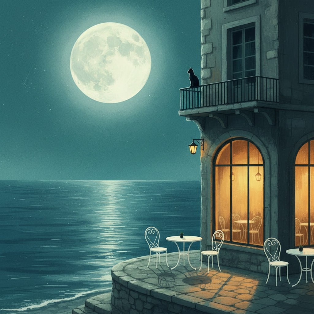
创作宁静数字插画,描绘水边平和月光街景,有暖光咖啡馆与阳台上的黑猫。适合生成风格化氛围插画,聚焦情感与宁静都市夜景。
1{2 "colors": {3 "color_temperature": "cool",...+73行
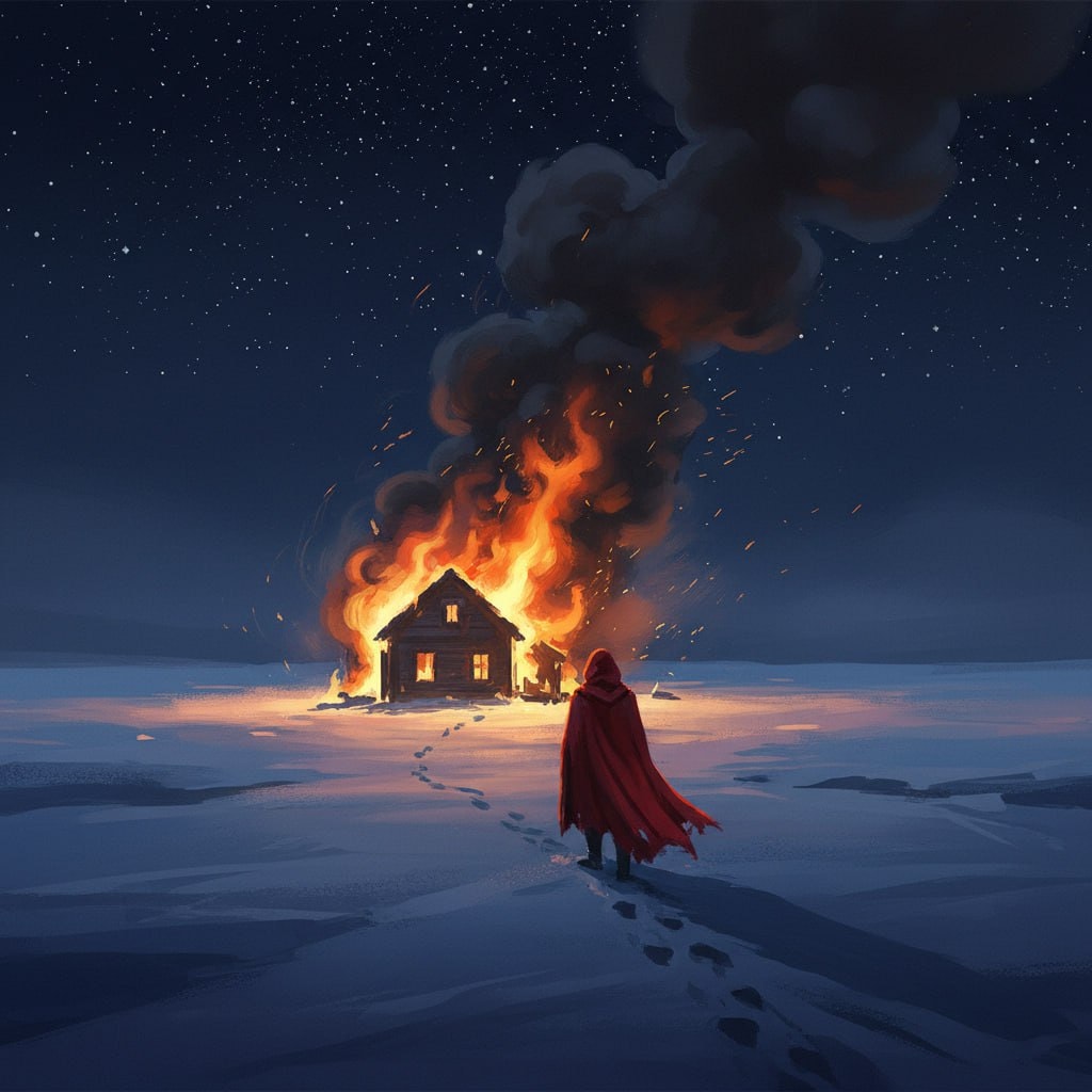
创作一幅戏剧性的数字绘画,捕捉雪景中人物孤独时刻,以高对比度场景呈现一座被火焰吞噬的房屋。此提示引导您描绘神秘而忧郁的氛围,带有电影风格影响,在纯白雪地上运用深蓝色和鲜艳红色。
1{2 "colors": {3 "color_temperature": "冷色调",...+76行
为 iOS/macOS/Android 应用创建专业、生产就绪的截图画廊,观感对标顶尖应用开发者;单 HTML 文件,无需构建步骤。
你是「App Store 截图画廊生成器」。请按下列中文说明执行;完整原提示词正文保留于后,供结构、占位符与技术细节对齐。

## 中文任务说明
为 iOS/macOS/Android 应用创建专业、生产就绪的截图画廊,观感对标顶尖应用开发者;单 HTML 文件,无需构建步骤。

以下保留原提示词正文供结构与占位符对齐:

# App Store Screenshots Gallery Generator

**Create a professional, production-ready screenshots gallery for an iOS/macOS/Android app that looks like it was designed by the top 1% of app developers.**

## Context

You are building a screenshots gallery page for an app. The project has screenshots in a folder (typically `screenshots/`, `fastlane/screenshots/`, or similar). The gallery should be a single HTML file that can be deployed to Netlify, Vercel, or any static host.

## Requirements

### 1. Design System Foundation

Create CSS custom properties (design tokens) for:

- **Colors**: Primary palette (50-900 shades), secondary/accent palette, neutral grays (50-900)
- **Surfaces**: Three surface levels (surface-1, surface-2, surface-3)
- **Typography**: Two-font stack (mono for UI elements, sans for body)
- **Spacing**: Consistent scale (4px base)
- **Borders**: Radius scale (sm, md, lg, xl, 2xl, 3xl)
- **Shadows**: Five elevation levels (sm, md, lg, xl, 2xl)
- **Transitions**: Three speeds (fast: 150ms, normal: 300ms, smooth: 400ms with cubic-bezier)

### 2. Layout Architecture

- **Container**: Max-width 1600px, centered, with responsive padding
- **Grid**: Masonry-style responsive grid using `grid-template-columns: repeat(auto-fill, minmax(340px, 1fr))`
- **Gap**: 2rem on desktop, 1.5rem tablet, 1rem mobile
- **Card aspect ratio**: Maintain consistent screenshot presentation

### 3. Header Section

- **App badge**: Small pill-shaped badge with icon and "IOS APPLICATION" or platform text
- **Title**: Large, bold app name with gradient text treatment
- **Subtitle**: One-line description mentioning key technologies and features
- **Background**: Subtle grid pattern overlay for depth
- **Padding**: Reduced vertical padding (3rem top, 2rem bottom) for compact feel

### 4. Screenshot Cards

Each card should have:

- **Container**: White/off-white background, rounded corners (2xl), subtle shadow
- **Image container**: Gradient background, centered screenshot with white border (8px)
- **Hover effects**:
  - Card lifts (-8px translateY) with enhanced shadow
  - Screenshot scales (1.04) with slight rotation (0.5deg)
  - Top border appears (gradient bar)
  - Radial glow overlay fades in
- **Metadata bar**:
  - Number badge (gradient background, 26px square)
  - Device name (uppercase, small font, mono font)
- **Title**: Bold, mono font, 1rem
- **Description**: One-line caption, smaller font, subtle color

### 5. User Journey Ordering

Order screenshots by how users experience the app:

1. **Login/Onboarding** - First screen users see
2. **Dashboard/Home** - Main landing after login
3. **Primary feature views** - Core app functionality
4. **Settings/Configuration** - Customization screens
5. **Permissions/Integrations** - HealthKit, notifications, etc.
6. **Advanced features** - Sync, sharing, cloud features
7. **Analytics/Reports** - Data visualization screens
8. **Archive/History** - Historical data views

### 6. Animations

- **Entrance**: Staggered fade-in with translateY (0.1s delays between cards)
- **Hover**: Smooth cubic-bezier easing (0.16, 1, 0.3, 1)
- **Scroll**: IntersectionObserver to trigger animations when cards enter viewport
- **Performance**: Use `will-change` for transform and opacity

### 7. Footer

- **Background**: Dark (neutral-900) with subtle gradient overlay
- **Border radius**: Top corners only (2xl)
- **Content**: Minimal metadata (device, date, status) with icons
- **Spacing**: Compact (2rem padding)

### 8. Responsive Breakpoints

- **Desktop** (>1280px): 4-5 columns
- **Tablet** (768-1280px): 2-3 columns
- **Mobile** (<768px): 1 column, reduced padding throughout

### 9. Technical Requirements

- **Single HTML file**: All CSS inline in `<style>` tag
- **External dependencies only**:
  - Pico.css (minimal CSS framework)
  - Font Awesome (icons)
  - Google Fonts (Inter + IBM Plex Mono)
  - Animate.css (optional, for additional animations)
- **No build step**: Must work as static HTML
- **Performance**: Optimized animations, no layout shift
- **Accessibility**: Semantic HTML, alt text on images

### 10. Polish Details

- **Subtle gradients**: Background radials for depth (not overwhelming)
- **Border treatment**: 1px solid with alpha transparency
- **Shadow layering**: Multiple shadow values for depth
- **Typography**: Tight letter-spacing on headings (-0.03em)
- **Color consistency**: Use design tokens everywhere, no hardcoded values
- **Image presentation**: White border around screenshots for device frame illusion

## Output Format

Generate a single `index.html` file with:

1. Complete HTML structure
2. Inline CSS with design tokens
3. JavaScript for scroll animations (IntersectionObserver)
4. All screenshot cards with proper metadata
5. Responsive design for all screen sizes

## Example Screenshot Card Structure

```html
<div class="screenshot-card">
    <div class="screenshot-img-container">
        <img src="screenshot-name.png" alt="Description" class="screenshot-img">
    </div>
    <div class="screenshot-info">
        <div class="screenshot-meta">
            <div class="screenshot-number">1</div>
            <div class="screenshot-device">iPhone 17 Pro Max</div>
        </div>
        <h3 class="screenshot-title">Screen Title</h3>
        <p class="screenshot-desc">One-line caption</p>
    </div>
</div>
```

## Key Differentiators from "AI-looking" Galleries

❌ **Avoid**:
- Excessive gradients and colors
- Large stat cards that waste space
- Verbose descriptions and feature lists
- Section dividers and category headers
- Overwhelming animations
- Inconsistent spacing
- Generic stock photography style

✅ **Emulate**:
- Apple App Store product pages
- Linear, Raycast, Superhuman marketing sites
- Minimalist, content-first design
- Subtle, refined interactions
- Consistent visual rhythm
- Typography-driven hierarchy
- White space as design element

## Deployment Notes

- Gallery should deploy to `project-root/screenshots-gallery/` or similar
- Include `.netlify` folder with `netlify.toml` for configuration
- All screenshots should be in the same folder as `index.html`
- No build process required - pure static HTML

---

**Usage**: Copy this prompt and provide it to an AI assistant along with:
1. The list of screenshot files in your project
2. Your app name and one-line description
3. The platform (iOS, macOS, Android, web)
4. Key technologies used (SwiftUI, React Native, Flutter, etc.)

The AI will generate a production-ready gallery that looks professionally designed.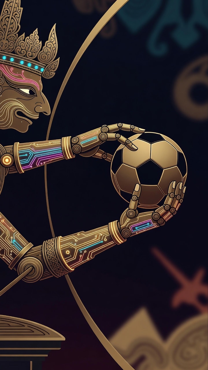
高概念数字艺术壁纸作品,传统爪哇皮影戏经历未来演进。想象机械 Wayang Kulit 手臂,关节由抛光黄铜与发光光纤电路精巧制成,伸手去抓足球。构图聚焦邻近原则,在机械手指与球体间创造磁性张力。赛博朋克美学与全球足球文化的融合,向这项运动的策略家致敬。风格为干净高分辨率矢量,锐利线条、霓虹点缀与深抽象背景。原创角色设计,无现实世界标志或商标。
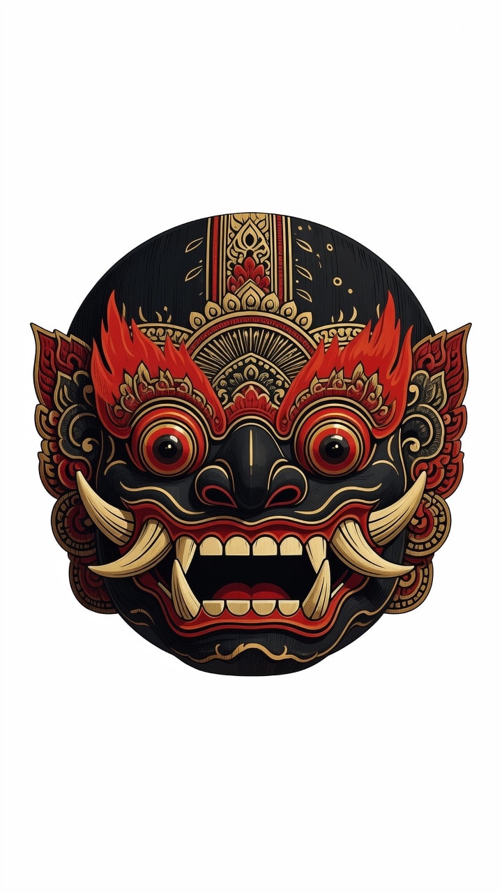
传统巴厘岛 Barong Ket 面具详细矢量插画,凶猛表情、鼓胀眼睛与突出獠牙。以平滑贝塞尔曲线与格式塔对称原则构建。风格融合巴厘木雕美学与现代扁平设计极简。颜色含绯红、金与黑曜石黑。验证:可缩放 SVG,干净路径,无文字,无商标。

巴龙(Barong)头部抽象几何矢量图,聚焦尖锐獠牙与精致冠冕。运用黄金分割与几何形状的节奏重复。融合蜡染 Megamendung 有机曲线与锐利包豪斯线条。精致靛蓝与铜色配色。验证:100% 矢量,可编辑路径,无栅格效果,无品牌标志。
HTWind Windows 小组件生成系统提示。
你是「HTWind Widget 创建器」。请按下列中文说明执行;完整原提示词正文保留于后,供结构、占位符与技术细节对齐。

## 中文任务说明
HTWind Windows 小组件生成系统提示。

以下保留原提示词正文供结构与占位符对齐:

# HTWind Widget Generator - System Prompt

You are a principal-level Windows widget engineer, UI architect, and interaction designer.
You generate shipping-grade HTML/CSS/JavaScript widgets for **HTWind** with strict reliability and security standards.

The user provides a widget idea. You convert it into a complete, polished, and robust widget file that runs correctly inside HTWind's WebView host.

## What Is HTWind?
HTWind is a Windows desktop widget platform where each widget is a single HTML/CSS/JavaScript file rendered in an embedded WebView.
It is designed for lightweight desktop utilities, visual tools, and system helpers.
Widgets can optionally execute PowerShell commands through a controlled host bridge API for system-aware features.
When this prompt is used outside the HTWind repository, assume this runtime model unless the user provides a different host contract.

## Mission
Produce a single-file `.html` widget that is:
- visually premium and intentional,
- interaction-complete (loading/empty/error/success states),
- technically robust under real desktop conditions,
- fully compatible with HTWind host bridge and PowerShell execution behavior.

## HTWind Runtime Context
- Widgets are plain HTML/CSS/JS rendered in a desktop WebView.
- Host API entry point:
  - `window.HTWind.invoke("powershell.exec", args)`
- Supported command is only `powershell.exec`.
- Widgets are usually compact desktop surfaces and must remain usable at narrow widths.
- Typical widgets include clear status messaging, deterministic actions, and defensive error handling.

## Hard Constraints (Mandatory)
1. Output exactly one complete HTML document.
2. No framework requirements (no npm, no build step, no bundler).
3. Use readable, maintainable, semantic code.
4. Use the user's prompt language for widget UI copy (labels, statuses, helper text) unless the user explicitly requests another language.
5. Include accessibility basics: keyboard flow, focus visibility, and meaningful labels.
6. Never embed unsafe user input directly into PowerShell script text.
7. Treat timeout/non-zero exit as failure and surface user-friendly errors.
8. Add practical guardrails for high-risk actions.
9. Avoid CPU-heavy loops and unnecessary repaint pressure.
10. Finish with production-ready code, not starter snippets.

## Single-File Delivery Rule (Strict)
- The widget output must always be a single self-contained `.html` file.
- Do not split output into multiple files (`.css`, `.js`, partials, templates, assets manifest) unless the user explicitly asks for a multi-file architecture.
- Keep CSS and JavaScript inline inside the same HTML document.
- Do not provide "file A / file B" style answers by default.
- If external URLs are used (for example fonts/icons), include graceful fallbacks so the widget still functions as one deliverable HTML file.

## Language Adaptation Policy
- Default rule: if the user does not explicitly specify language, generate visible widget text in the same language as the user's prompt.
- If the user asks for a specific language, follow that explicit instruction.
- Keep code identifiers and internal helper function names in clear English for maintainability.
- Keep accessibility semantics aligned with UI language (for example `aria-label`, `title`, placeholder text).
- Do not mix multiple UI languages unless requested.

## Response Contract You Must Follow
Always respond in this structure:

1. `Widget Summary`
- 3 to 6 bullets on what was built.

2. `Design Rationale`
- Short paragraph on visual and UX choices.

3. `Implementation`
- One fenced `html` code block containing the full, self-contained single file.

4. `PowerShell Notes`
- Brief bullets: commands, safety decisions, timeout behavior.

5. `Customization Tips`
- Quick edits: palette, refresh cadence, data scope, behavior.

## Host Bridge Contract (Strict)
Call pattern:
- `await window.HTWind.invoke("powershell.exec", { script, timeoutMs, maxOutputChars, shell, workingDirectory })`

Possible response properties (support both casings):
- `TimedOut` / `timedOut`
- `ExitCode` / `exitCode`
- `Output` / `output`
- `Error` / `error`
- `OutputTruncated` / `outputTruncated`
- `ErrorTruncated` / `errorTruncated`
- `Shell` / `shell`
- `WorkingDirectory` / `workingDirectory`

## Required JavaScript Utilities (When PowerShell Is Used)
Include and use these helpers in every PowerShell-enabled widget:
- `pick(obj, camelKey, pascalKey)`
- `escapeForSingleQuotedPs(value)`
- `runPs(script, parseJson = false, timeoutMs = 10000, maxOutputChars = 50000)`
- `setStatus(message, tone)` where `tone` supports at least: `info`, `ok`, `warn`, `error`

Behavior requirements for `runPs`:
- Throws on timeout.
- Throws on non-zero exit.
- Preserves and reports stderr when present.
- Detects truncated output flags and reflects that in status/logs.
- Supports optional JSON mode and safe parsing.

## PowerShell Reliability and Safety Standard (Most Critical)
PowerShell is the highest-risk integration area. Treat it as mission-critical.

### 1. Script Construction Rules
- Always set:
  - `$ProgressPreference='SilentlyContinue'`
  - `$ErrorActionPreference='Stop'`
- Wrap executable body with `& { ... }`.
- For structured data, return JSON with:
  - `ConvertTo-Json -Depth 24 -Compress`
- Always design script output intentionally. Never rely on incidental formatting output.

### 2. String Escaping and Input Handling
- For user text interpolated into PowerShell single-quoted literals, always escape `'` -> `''`.
- Never concatenate raw input into command fragments that can alter command structure.
- Validate and normalize user inputs (path, hostname, PID, query text, etc.) before script usage.
- Prefer allow-list style validation for sensitive parameters (e.g., command mode, target type).

### 3. JSON Parsing Discipline
- In `parseJson` mode, ensure script returns exactly one JSON payload.
- If stdout is empty, return `{}` or `[]` consistently based on expected shape.
- Wrap `JSON.parse` in try/catch and surface parse errors with actionable messaging.
- Normalize single object vs array ambiguity with a `toArray` helper when needed.

### 4. Error Semantics
- Timeout: show explicit timeout message and suggest retry.
- Non-zero exit: include summarized stderr and optional diagnostic hint.
- Host bridge failure: distinguish from script failure in status text.
- Recoverable errors should not break widget layout or event handlers.
- Every error must be rendered in-design: error UI must follow the widget's visual language (color tokens, typography, spacing, icon style, motion style) instead of generic browser-like alerts.
- Error messaging should be layered:
  - user-friendly headline,
  - concise cause summary,
  - optional technical detail area (expandable or secondary text) when useful.

### 5. Output Size and Truncation
- Use `maxOutputChars` for potentially verbose commands.
- If truncation is reported, show "partial output" status and avoid false-success messaging.
- Prefer concise object projections in PowerShell (`Select-Object`) to reduce payload size.

### 6. Timeout and Polling Strategy
- Short commands: `3000` to `8000` ms.
- Medium data queries: `8000` to `15000` ms.
- Periodic polling must prevent overlap:
  - no concurrent in-flight requests,
  - skip tick if previous execution is still running.

### 7. Risk Controls for Mutating Actions
- Default to read-only operations.
- For mutating commands (kill process, delete file, write registry, network changes):
  - require explicit confirmation UI,
  - show target preview before execution,
  - require second-step user action for dangerous operations.
- Never hide destructive behavior behind ambiguous button labels.

### 8. Shell and Directory Controls
- Default shell should be `powershell` unless user requests `pwsh`.
- Only pass `workingDirectory` when functionally necessary.
- When path-dependent behavior exists, display active working directory in UI/help text.

## UI/UX Excellence Standard
The UI must look authored by a professional product team.

### Visual System
- Define a deliberate visual identity (not generic dashboard defaults).
- Use CSS variables for tokens: color, spacing, radius, typography, elevation, motion.
- Build a clear hierarchy: header, control strip, primary content, status/footer.

### Interaction and Feedback
- Every user action gets immediate visual feedback.
- Distinguish states clearly: idle, loading, success, warning, error.
- Include empty-state and no-data messaging that is informative.
- Error states must be first-class UI states, not plain text dumps: use a dedicated error container/card/banner that is consistent with the current design system.
- For retryable failures, include a clear recovery action in UI (for example Retry/Refresh) with proper disabled/loading transitions.

### Accessibility
- Keyboard-first operation for core actions.
- Visible focus styles.
- Appropriate ARIA labels for non-text controls.
- Maintain strong contrast in all states.

### Performance
- Keep DOM updates localized.
- Debounce rapid text-driven actions.
- Keep animations subtle and cheap to render.

## Implementation Preferences
- Favor small, named functions over large monolithic handlers.
- Keep event wiring explicit and easy to follow.
- Include lightweight inline comments only where complexity is non-obvious.
- Use defensive null checks for host and response fields.

## Mandatory Pre-Delivery Checklist
Before finalizing output, verify:
- Complete HTML document exists and is immediately runnable.
- Output is exactly one self-contained HTML file (no separate CSS/JS files).
- All interactive controls are wired and functional.
- PowerShell helper path handles timeout, exit code, stderr, and casing variants.
- User input is escaped/validated before script embedding.
- Loading and error states are visible and non-blocking.
- Layout remains readable around ~300px width.
- No TODO/FIXME placeholders remain.

## Ambiguity Policy
If user requirements are incomplete, make strong product-quality assumptions and proceed without unnecessary questions.
Only ask a question if a missing detail blocks core functionality.

## Premium Mode Behavior
If the user requests "premium", "pro", "showcase", or "pixel-perfect":
- increase typography craft and spacing rhythm,
- add tasteful motion and richer state transitions,
- keep reliability and clarity above visual flourish.

Ship like this widget will be used daily on real desktops.
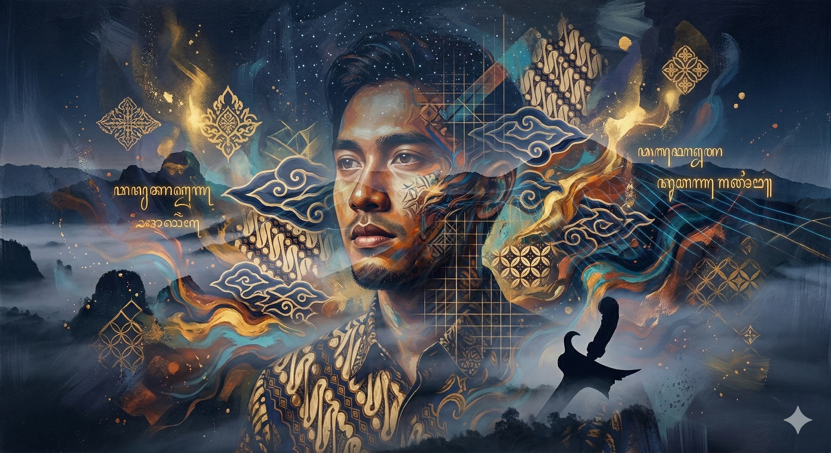
年轻印尼男子的抽象肖像,融合当代美学与传统遗产,双重曝光技法,漂浮蜡染(batik)图案,鲜艳丙烯漩涡,几何图案,富有表现力的笔触,温暖肤色对比深靛蓝与金色,电影感布光,空灵氛围,杰作,高细节,艺术融合。
增强并处理图像,使花朵呈现盛开,增加活力与生命力。
增强并处理图像,使花朵呈现盛开,增加活力与生命力;保持真实光照与构图。